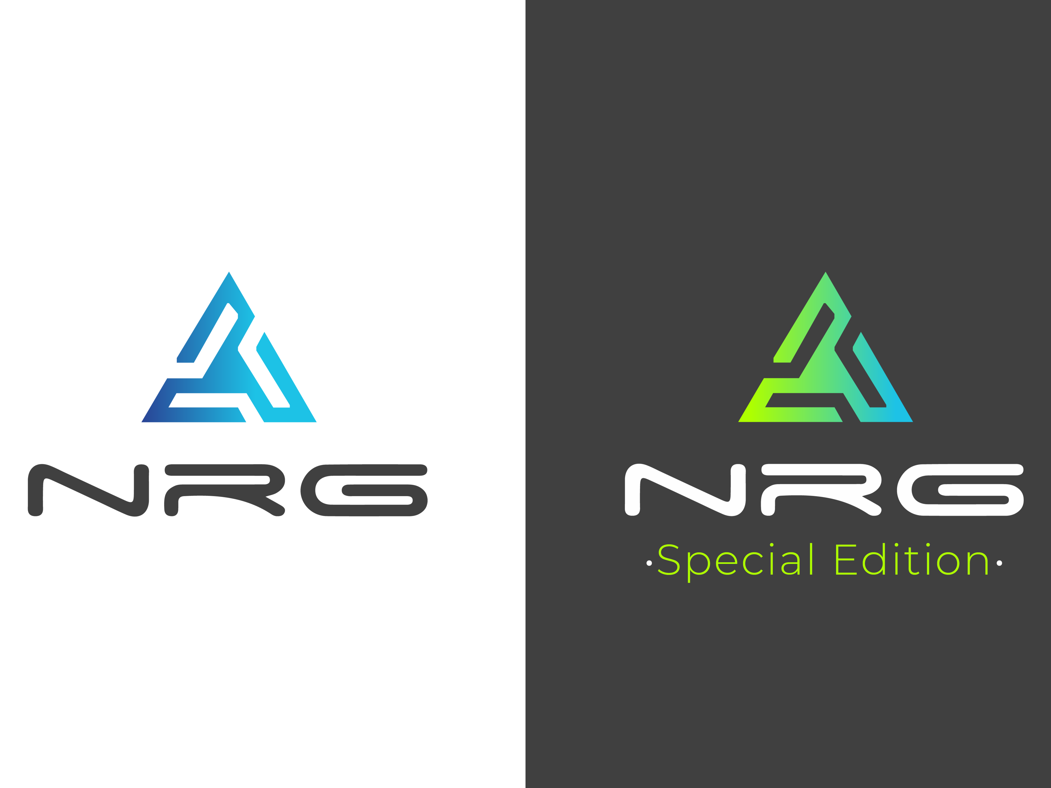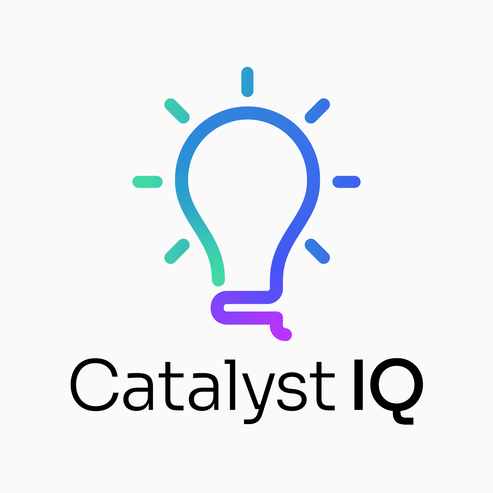
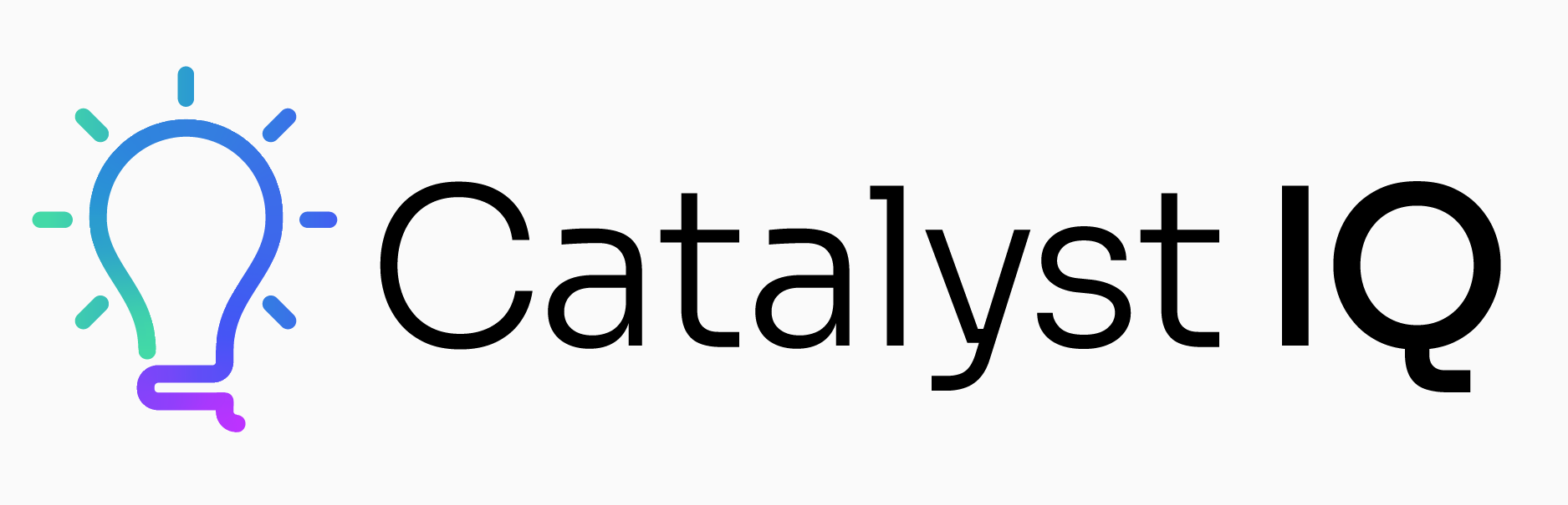
I was commissioned to do a brand update for a B2B data analytics and marketing services company. Their current logo felt dated, and they wanted a fresh take on the brand.
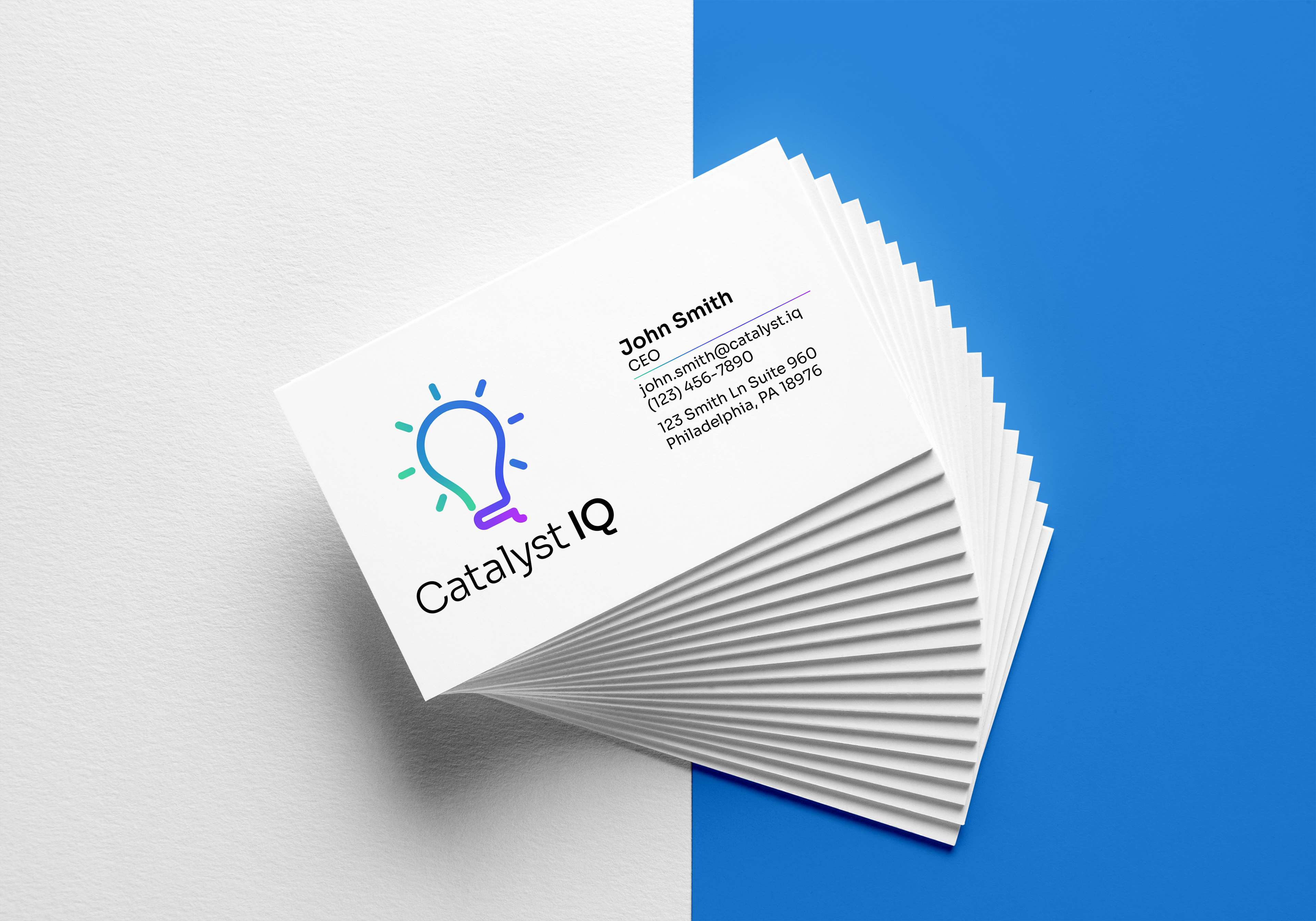
I went with a "thick outline" style in order to give the logomark a nice, distinctive silhouette when up against other companies. The bottom of the logomark has the tail of a lowercase "q," to further evoke some character. I decided to pair the logomark with a wordmark, using Sora as the font. I like Sora for its blend of curvy stylings with "terminal" code characteristics.
For colors, I went with a "catalyst" gradient. Since catalysts spark chemical reactions, the bright neon colors set off an exciting, modern feel.
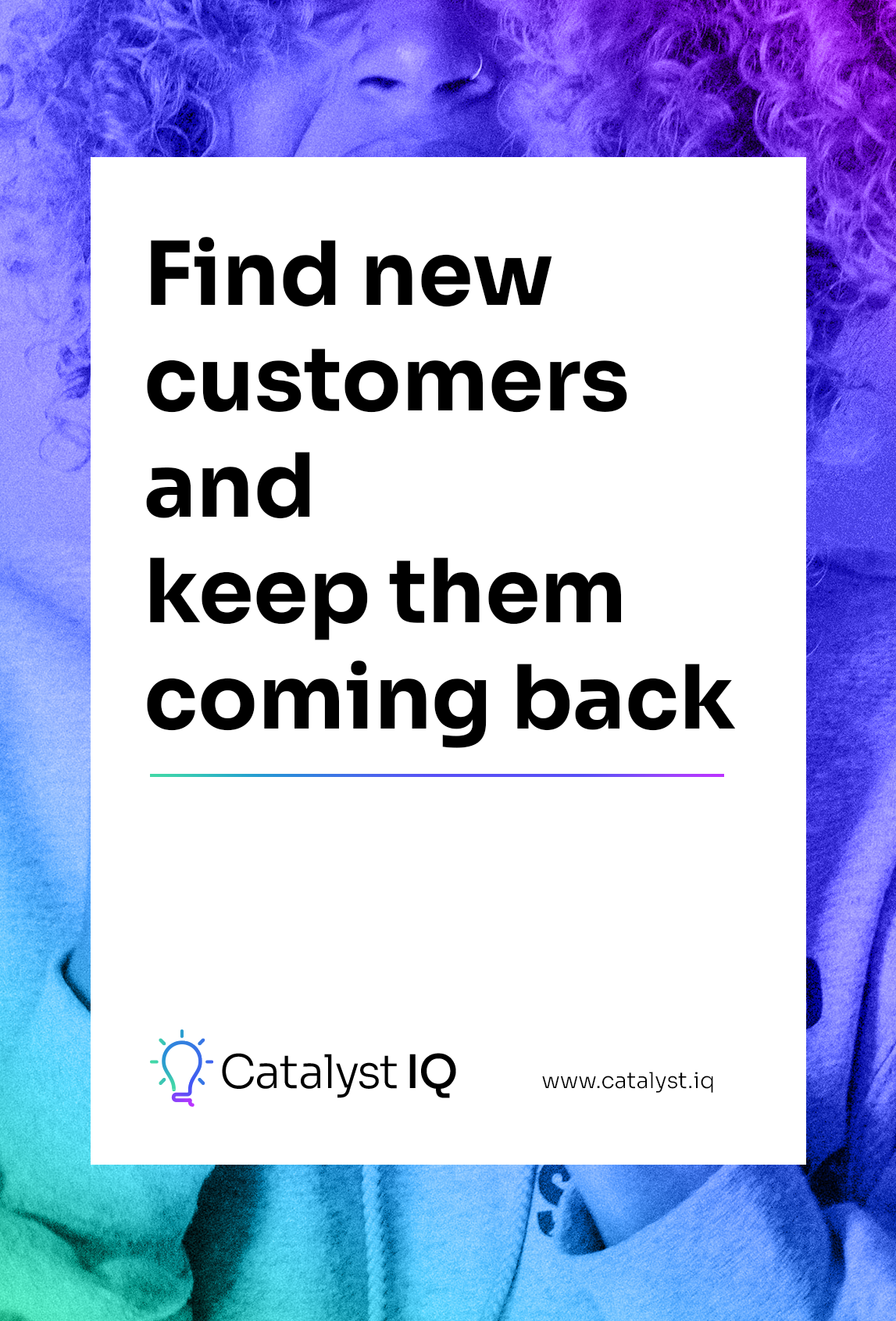
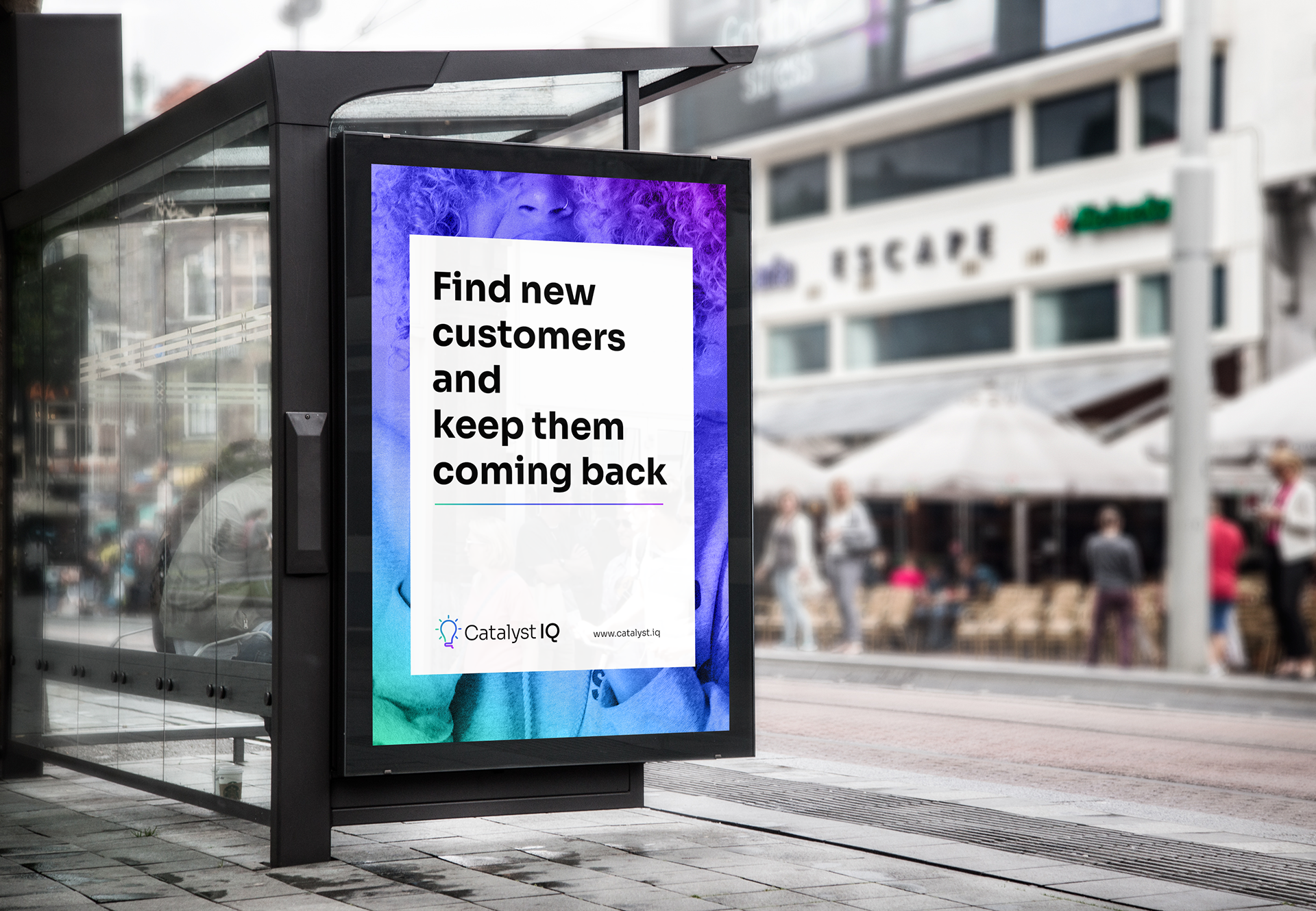
For a mock ad, I wanted to attract the viewer with the "catalyst" gradient, while also depicting a diverse, real presentation of a customer. The tagline is simple, large and effective. The aesthetic used is specifically targeting key decision-makers at startup companies.


Here's a side by side comparison of the old logo (left) with the updated logo (right).