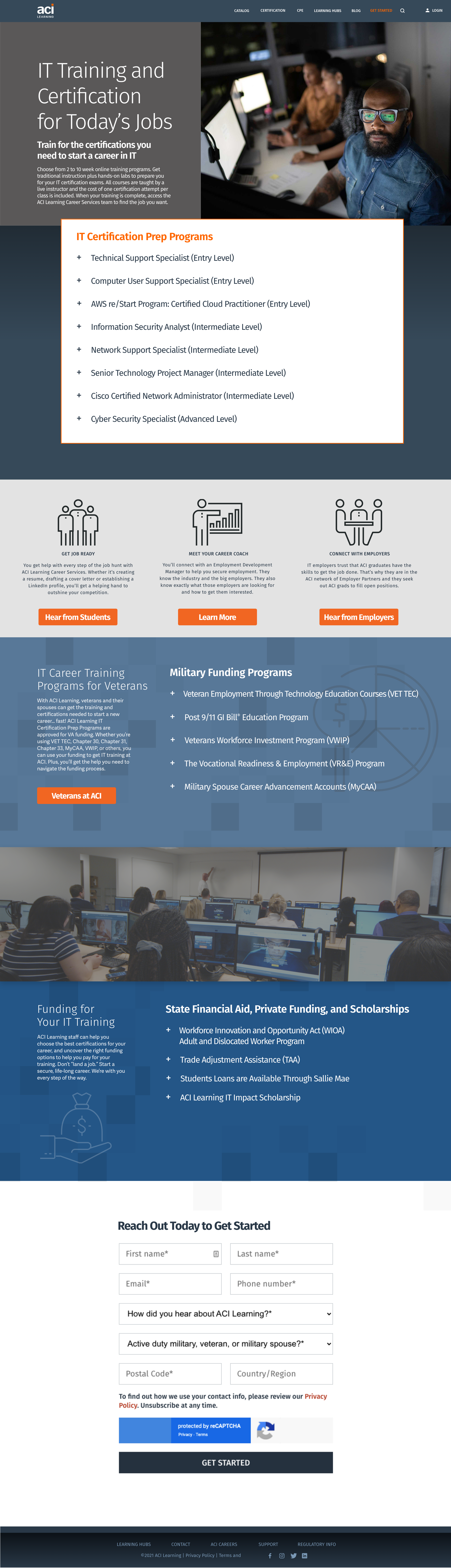
IT Certification Prep Pillar Page: For this mockup, I wanted to highlight not only the diversity in IT, but the broad spectrum of options that people can have when entering into IT. I changed the foldout menu style for this page to increase contrast/readability, and rounded the CTA button corners in order to make them friendlier for the user. The CTA at the bottom of the page differentiates in style in order to stand out as the final chance for the user to engage. We saw a lot of success and increased user engagement with this redesign.
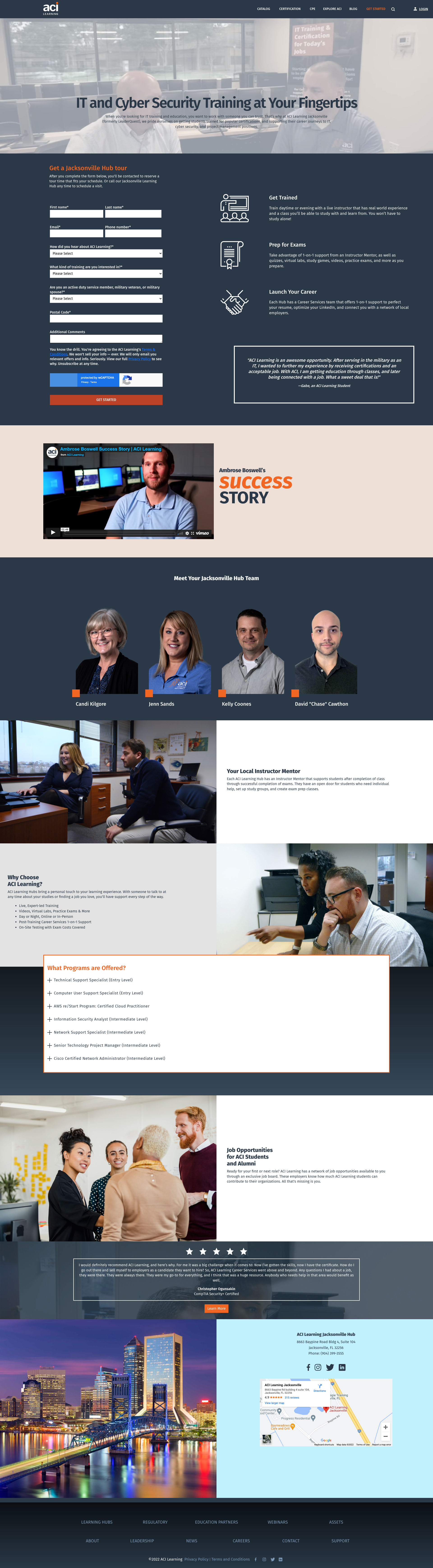
Learning Hubs Pillar Page: This page is one of five that highlight the on-site learning hubs that ACI offers. I pushed to implement in-house photography and videography in order to authentically represent our services. The high-contrast foldout menu was also implemented in these pages. For the staff profile pictures, I made the call to use more modern-looking cutouts, as they stand out compared to traditional backgrounds.
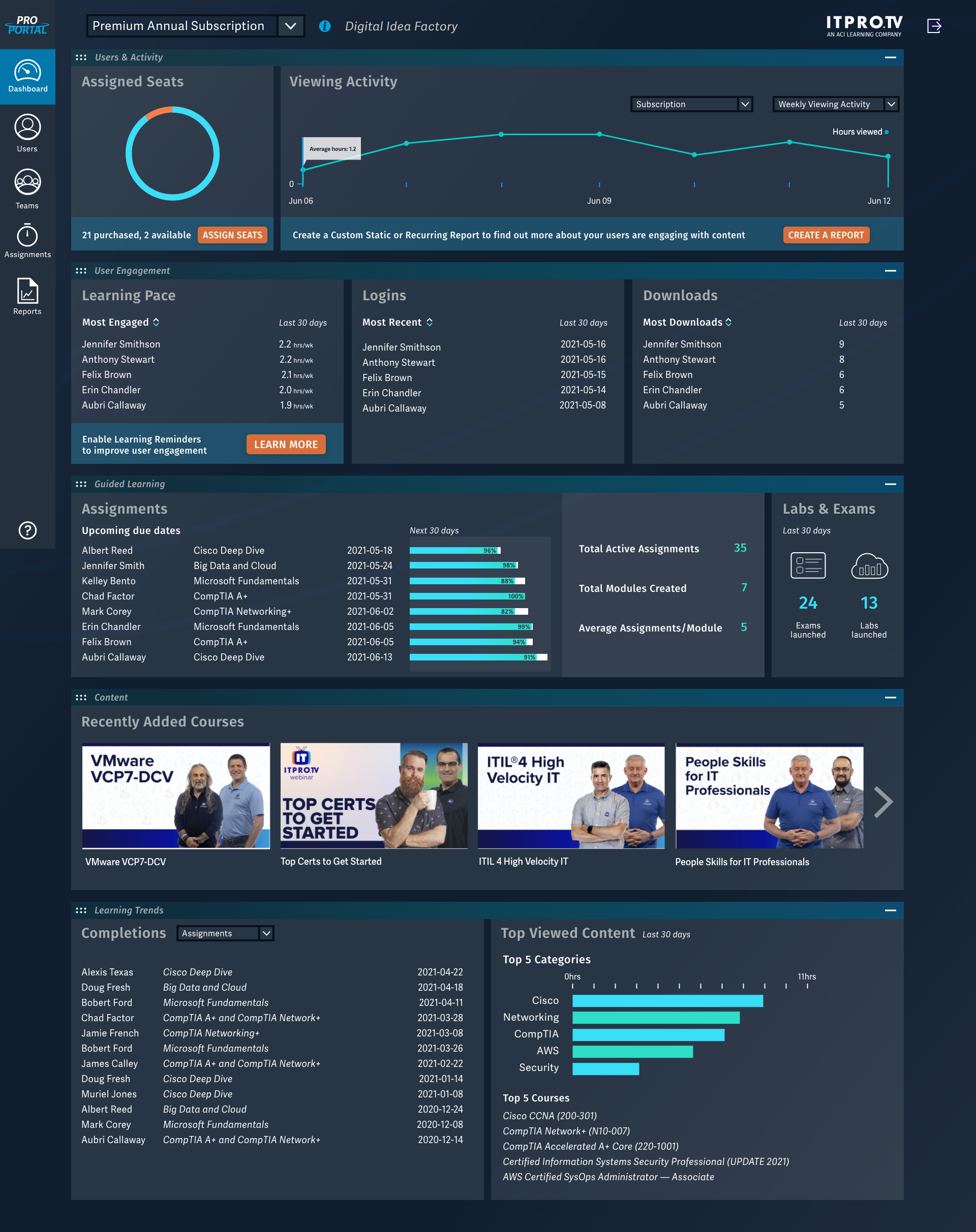
ProPortal Dashboard: This dashboard was a collaborative effort with the UX team to revamp the dashboard into a 2.0. It is used by managers and directors to accurately assess the progress of their teams while taking ACI's course offerings. In these mockups, I implemented good color psychology as well as prominent, friendly CTAs. I also helped pad out the spacing of the menus so they're less overwhelming to the user. Text hierarchy was also a big factor in these redesigns.
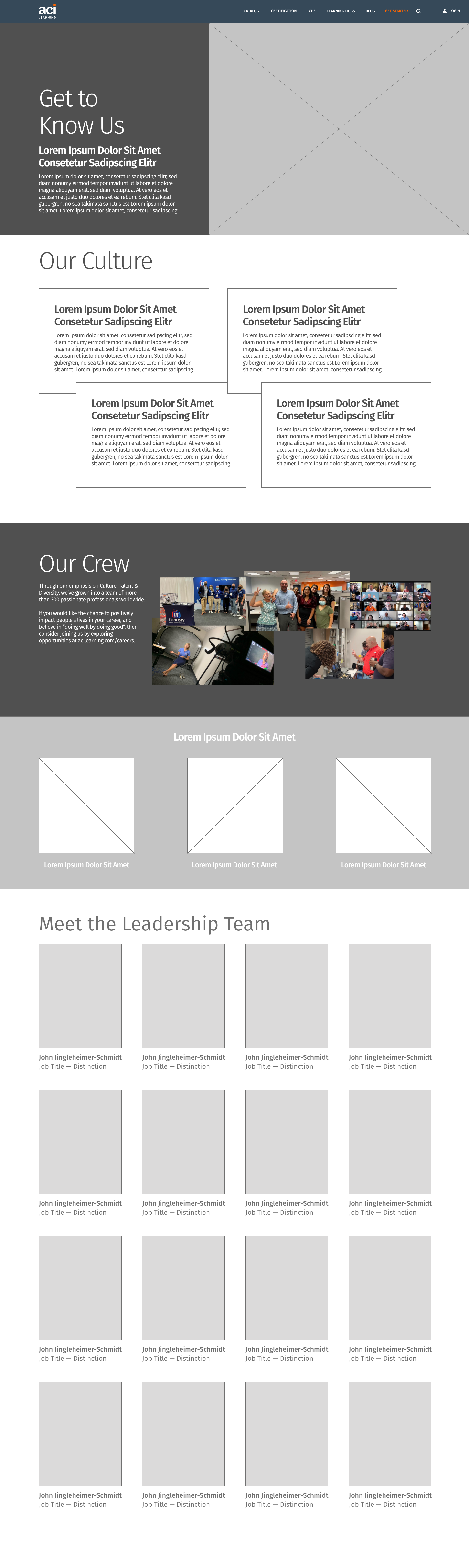
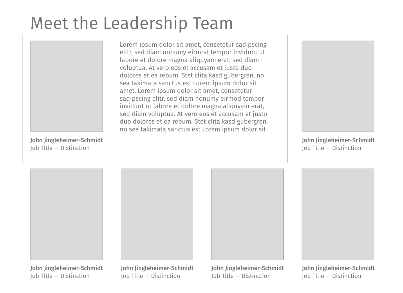
Crew & Culture/Leadership Page Wireframe: For the leadership page, I sat down with the CEO and helped reach a better reorganization of the page that prioritizes our company's employees first. At the bottom, the leadership profile pictures expand into "cards" to get more familiar with upper management and ELT.